Brise-soleils

The following text was originally published in Spanish on May 28, 2020 by the Fundación por la Arquitectura of the Architects and Landscape Architects Association of Puerto Rico (CAAPPR) as part of their campaign ”Arqui Desde Casa” during the lockdown period due to Covid-19. Scroll down for English translation.

La piel de la arquitectura de Henry Klumb

Las siguientes acuarelas se centran en la obra del arquitecto alemán radicado en Puerto Rico, Henry Klumb, especialmente en los quiebrasoles y mamparas que utilizó en la mayoría de sus obras institucionales.

Mucho se ha escrito sobre el trabajo de Klumb y su deseo — casi un predicamento — de producir una arquitectura adaptada al trópico, emplazada para beneficiarse de la ventilación cruzada, garantizando su habitabilidad sin exponerla al innecesario consumo energético.

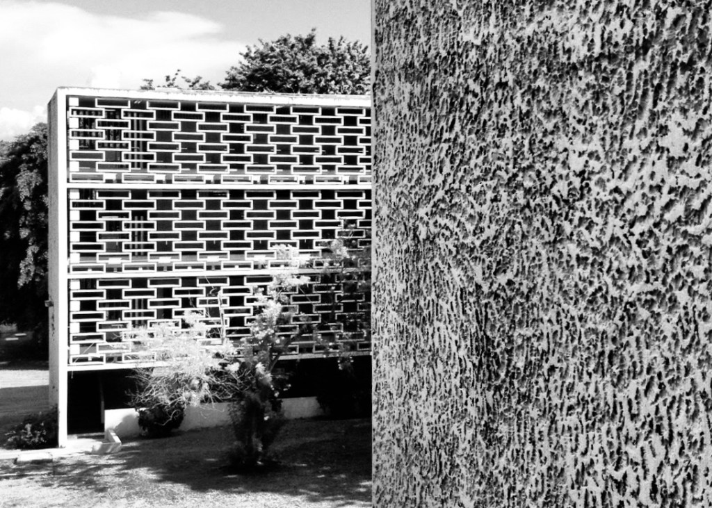
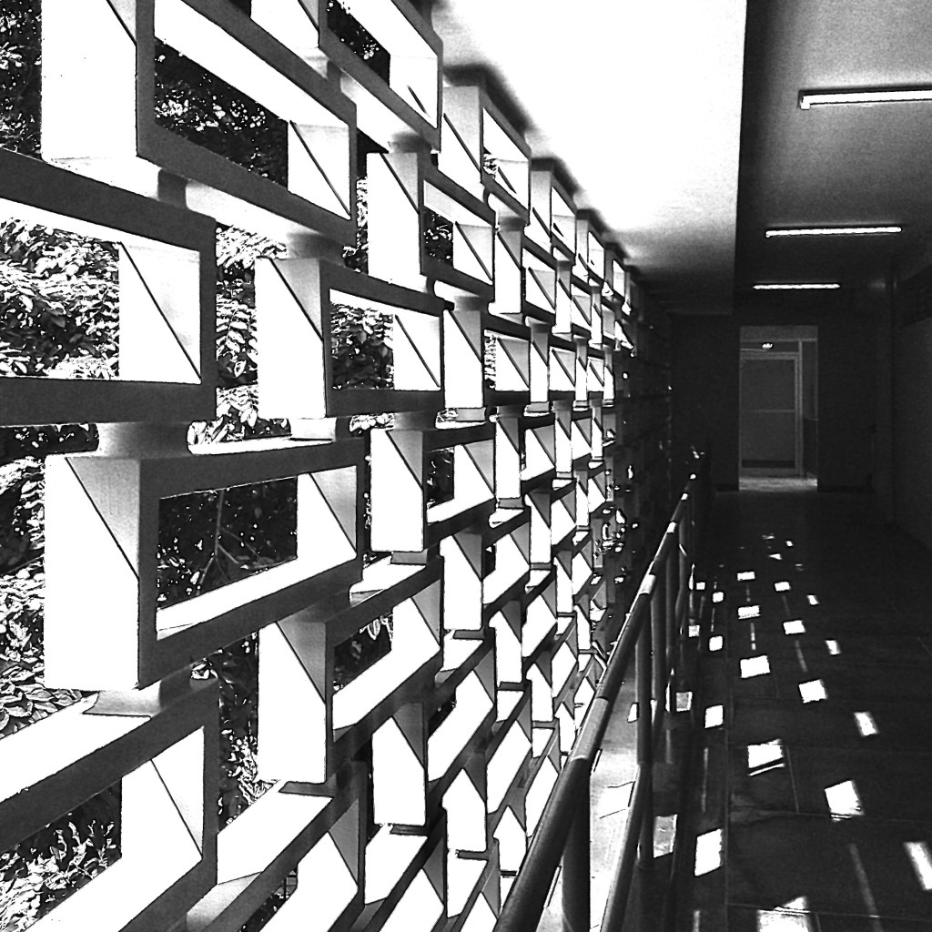
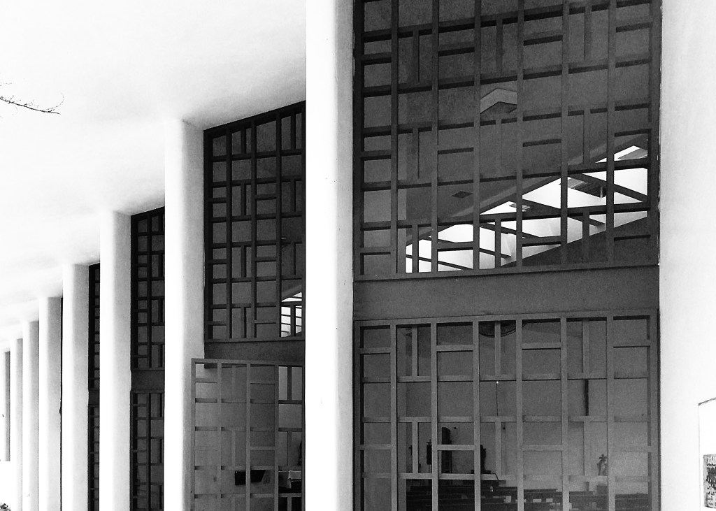
Aquellos que han experimentado su obra en persona reconocen el rol protagónico de los sistemas de quiebrasoles o brise-soleils en la experiencia de su arquitectura. En especial la forma en que estos matizan el impacto del sol, contribuyen a la privacidad (y, en muchos casos, seguridad) y la capacidad de relacionar la actividad del exterior con la de los espacios interiores.

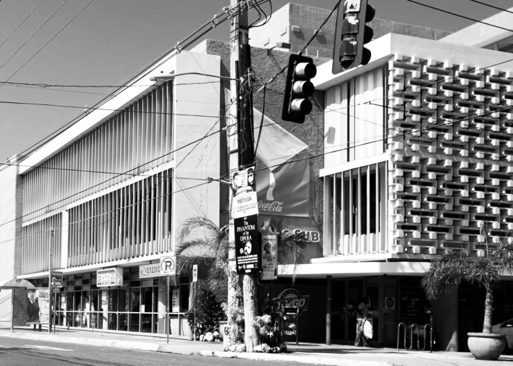
Ahora bien, a quien haya mirado de cerca los edificios que incorporan estas pieles permeables, poca imaginación hace falta para reconocer que mucho del carácter de estas estructuras recae en estos elementos prefabricados.

Invito a idearnos estos edificios sin su piel, cuando entonces se revela una arquitectura de pocas complicaciones o pretensiones, con ventanas de celosías de madera, aluminio (tipo “Miami”) o de paños de cristal, junto a muros lisos de bloques de cemento empañetados, en fin, una arquitectura opuesta a lo que muchos esperan de obras institucionales.

Tal señalamiento no propone restarle mérito a la obra de Klumb, pues excepciones sobresalientes abundan en su arquitectura. Solo basta mencionar el patio de la Escuela de Derecho, el corte transversal de administración de empresas y la capilla del convento dominico, por mencionar solo unos cuantos.

Por el contrario, el argumento recae más que nada en los volúmenes que se visten de los quiebrasoles, donde se reconoce en el diseñador la habilidad de producir una arquitectura “corriente” o más bien “plain” y dotarla de aspiración estética mediante el sencillo acto de enriquecer sus fachadas, despejadas de elementos prescindibles a través de su piel.

Fachada (Oeste)
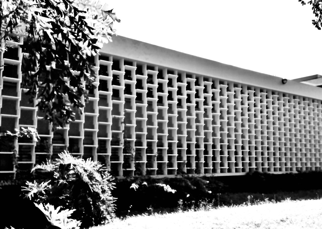
Edificios Osuna, O’Neill, Betances y Rivera de Alvarado
(Facultades de Administración de Empresas y Ciencias Sociales, Universidad de Puerto Rico, Recinto de Río Piedras)
Fachada principal (Este)
Edificio IBM
(Kings Court y Calle Loiza, San Juan)
Fachadas este y oeste
Escuela de Derecho
(Universidad de Puerto Rico, Recinto de Río Piedras)
Mamparas de madera (auditorio/capilla)
Convento de los Frailes Dominicos
(Bayamón, Puerto Rico)
Mamparas de aluminio (fachada principal)
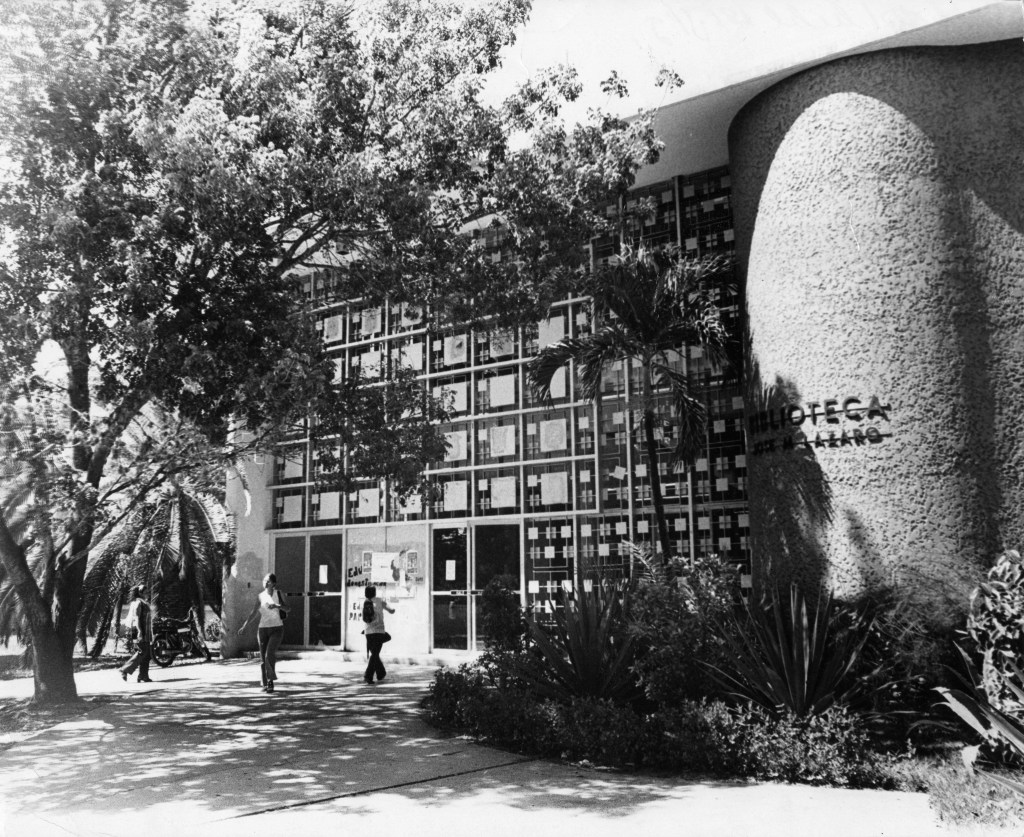
Biblioteca José M. Lázaro
(Universidad de Puerto Rico, Recinto de Río Piedras)

The skin of Henry Klumb’s architecture

The following watercolors focus on the work of the German architect based in Puerto Rico, Henry Klumb, especially on the sunscreens that he employed in most of his institutional works.

Much has been written about Klumb’s work and his desire – almost a predicament – to produce an architecture adapted to the tropics, located to benefit from cross-ventilation, guaranteeing its habitability without exposing it to unnecessary energy consumption.

Those who have encountered his work in person recognize the protagonist role the sunscreen or brise-soleil systems play in the architectural experience. Especially the way in which these diminish the sun’s impact, contribute to privacy (and, in many cases, security), and their capacity to merge the interior spaces with their surrounding environment.

Whoever has glanced closely at the buildings that incorporate these permeable sinks, little imagination requires to recognize that much of the character of the structures lies in the precast elements.

I invite to visualize these buildings without their skin, only then an architecture of few pretentions is revealed, one of cement plastered CMU walls with aluminum, wood, or, glass pane windows. In short, an architecture contrary to what many would expect of institutional buildings.

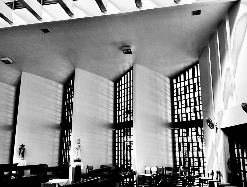
Such assertion does not intend to detract from Klumb’s work, since outstanding exceptions abound in his architecture. For example, the courtyard of the Escuela de Derecho, the cross-section of the business administration building, and the chapel of the Dominican convent, to name just a few.

On the contrary, more than anything, the argument is aimed at the volumes that are dressed with these sunscreens, where the designer is recognized for his ability to produce “ordinary” or rather “plain” architecture and endow it with aesthetic aspiration through the simple act to enriching its façades, cleared of expendable elements through their skin.

All photos by author unless specified otherwise.

Facultad de Administración de Empresas
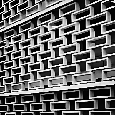
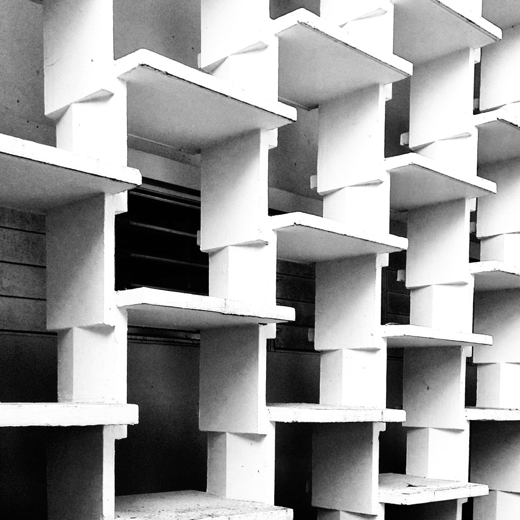
The brise-soleil system consists of a series of rectangular prefabricated elements of approximately 1ft height, 4ft long, 10in deep, and 2 1/2in thick installed in a staggered pattern. Each block seats on concrete trapezoidal prisms that embed to each element to keep the skin in place and restrain its lateral movement.
Edificio IBM
Rectangular elements of approximately 1ft height, 4ft long, 10in deep and 2 1/2in thick (same as described above). The system is also installed in a staggered pattern but in this case, the separators are a series of solid concrete blocks, 6in x 6in x 12in. Each element is embedded with concrete pegs to restrain the system from lateral displacement.
Escuela de Derecho
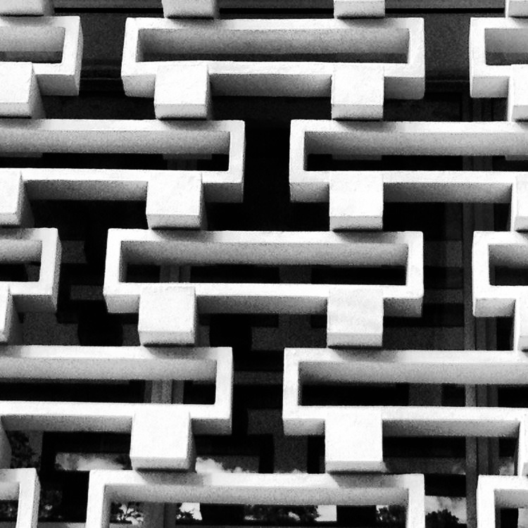
The most complex skin system developed by Klumb. Consist of a series of prefabricated reinforced concrete columns and slabs.

The columns are shaped in zig-zag or serpenting pattern to provide a seat for the slabs. The columns are shaped in a way they coupled with the slabs (male and female) restraint the displacement of the tablets.

The columns are installed at equal spacing (about 18in apart) and each pair is mirrored to provide a staggered pattern for the slabs. The slabs are 2 1/2” thick x 18in wide and 24in deep, while the columns have a thickness of 3in.

chapel of saint ignatius, steven holl

Designed by Steven Holl, the Chapel of Saint Ignatius was conceived as “…seven bottles of light in a stone box…” in reference to San Ignacio de Loyola’s vision of a spiritual life comprised of darkness and light, which he referred as consolations and desolations.

The chapel was built in 1997 and it is located in the campus of Seattle University in First Hill, Downtown Seattle. The main structure of the chapel was erected in twelve hours due to the use of tilt-up concrete walls. Such method of tilt-up construction is traditionally used where the repetition and mass production of panels guarantee speed, therefore cost-effectiveness. In contrast, every panel used at the chapel is unique. Each pre-cast concrete wall (“stone box”) has a distinct profile designed to interlock in order to form slits that let in natural light. In addition, the walls provide distinctive profiles from where a lightweight construction roof curves and contorts to form skylights (bottles of light) that allow in additional natural light. The light entering through the slits and skylights is filtrated by a mix of colored, translucent and transparent glass and it does not enter directly into the space. Curving walls serve as baffles where light bounce off. Each baffle has a complementary color to the color of the glass. The reflected light gets redirected towards the walls in a subtle — yet intense — way. All interior walls have been finished with a textured plaster and what seems at first as an odd design decision, once bathed in light, becomes clear to the keen observer.

The sketches below record my first two visits to the chapel. It was raining during my first visit so I could not experience the incidence of natural light entering through the skylights. On the second visit, however, the experience was completely different. When the reflected colored natural light structs the rugged texture of the interior plaster, it creates an optical illusion. Father Gerald T. Cobb S.J. refers to the light that enters the chapel as “…light that acts like liquid, an aqueous medium spilling across interior surfaces.” In truth, it is a difficult effect to describe but the chapel interiors bathed in light give a sense as if inhabiting a watercolor.

Steven Holl’s pursuit for phenomenological occurrences is well known. In his essay A Gathering of Different Lights he mentions “… to feel these physicalities is to become a subject of the senses.” Furthermore, he adds that… “an awareness of one’s unique existence in space is essential in developing a consciousness of perception.”

Entrance & Procession; view from the Narthex towards the Baptistry.

Baptistry. Inscribed at the edge of the baptismal font: “No barrier can divide where life unites: one faith, one fount, one spirt, makes one people.”

Main Sanctuary (view from baptistry)

Main Sanctuary (towards the altar)

Main Sanctuary (view from the altar)

Holl assures us that “architecture holds the power to inspire and transform our day-to-day existence.” And while I do not claim that my sketches illustrate the phenomenon I experienced, they certainly give a sense of the spatial quality of the chapel. In fact, in my opinion, having examined Holl’s own watercolors for Saint Ignatius, they also fall short at representing the effect. However, whether intentional or not, the experience is there. Well done Holl.

Choir (looking towards the Main Sanctuary)

poetry foundation

These sketches were done a year after I first visited this place in 2015. (Please refer to a previous post below for that first visit.) https://anonymousarchitecture.wordpress.com/2015/06/14/the-poetry-foundation-by-john-ronan-architects/

It’s been almost four years since that first visit and three since I made these interior sketches. In retrospect, I still think this is one of the most beautiful buildings I have encountered in recent years.

Plaza de Armas, Viejo San Juan


Transformed several times throughout the years Plaza de Armas today is arguably one of the best public squares in Old San Juan, Puerto Rico. The current design -depicted above- is from the 1980’s and belongs to architect, Alberto del Toro (assisted by the dissolved firm Arce y Rigau).

The space was last rehabilitated almost two decades ago. The works dealt with minor repairs to the pavements and sitting areas, but additional trees were added. Fortunately, the new planting followed the existing structure and a second line of trees — of the same species — was paired with the existing. For that reason, the original spatial organization devised by the designers remained unchanged. Some could argue that it was reinforced with the addition.

Plaza de Armas is rectangular in shape, conformed by contiguous buildings along its four sides where two civic structures stand out, the Departamento de Estado o Real Intendencia to the West (right in the top sketch) and the Ayuntamiento or Alcaldía de San Juan to the North (center down in the sketch, also at the perspective below). It is worth noting that the space does not align with any of the afore-mentioned buildings. However, the skillful designer(s) organized the urban elements at their disposition to compensate for the ‘misalignment’.

Therefore, as illustrated, a telephone cabin, a fountain and a “glorieta”, along with the mass of trees — all composed to acknowledge and reinforce — the City Hall’s main axis, perpendicular to the plaza. The mass of trees further recognize the building’s protruding arcades and the towers that flank them. (See sketch below, illustrating this space back in 2002).

The space conformed by the surrounding buildings is rectangular. However, the space’s proportion is less important than the composition of the urban elements inside the paved area of the square. The arrangement is what really organizes the space. The paved area has a proportion of 1:3.5; one square wide by three and a half squares long. The alignment with the Ayuntamiento (as illustrated) is far more hierarchical than the alignment with the Real Intendencia. Nevertheless, two monumental light posts – no others alike are to be found in the square – recognize the Real Intendencia’s longitudinal axis. Thus, proving that neither the longitudinal or transversal axis of the rectangular geometry of the space (without relating to any structure) is as relevant as the axis created by the arrangement of elements drawn by the skillful hand of the designers.

Casa Vives, Ponce, Puerto Rico

A few years ago my wife Claudia Rosa-López and I led a group of students from Polytechnic University in documenting this house. With their set of drawings they earned a Third Place award at Peterson Prize, sponsored by the Historic American Building Survey of National Park Service. Today, the students’ drawings can be accessed at the Library of Congress site through this link: https://www.loc.gov/item/pr1528/

Built about 1860 and designed by French immigrant architect Juan Bertoli Calderoni, Casa Vives in Ponce, Puerto Rico is an outstanding example of a 19th-century Puerto Rican urban residence with commercial spaces on the ground floor and residential spaces above.

places i’ve drawn, but have not yet visited series: erik bryggman’s chapel of resurrection

This is a set of drawings I often made when I taught a course on History of Modern Architecture at Polytechnic University in Puerto Rico.