chapel of saint ignatius, steven holl

Designed by Steven Holl, the Chapel of Saint Ignatius was conceived as “…seven bottles of light in a stone box…” in reference to San Ignacio de Loyola’s vision of a spiritual life comprised of darkness and light, which he referred as consolations and desolations.

The chapel was built in 1997 and it is located in the campus of Seattle University in First Hill, Downtown Seattle. The main structure of the chapel was erected in twelve hours due to the use of tilt-up concrete walls. Such method of tilt-up construction is traditionally used where the repetition and mass production of panels guarantee speed, therefore cost-effectiveness. In contrast, every panel used at the chapel is unique. Each pre-cast concrete wall (“stone box”) has a distinct profile designed to interlock in order to form slits that let in natural light. In addition, the walls provide distinctive profiles from where a lightweight construction roof curves and contorts to form skylights (bottles of light) that allow in additional natural light. The light entering through the slits and skylights is filtrated by a mix of colored, translucent and transparent glass and it does not enter directly into the space. Curving walls serve as baffles where light bounce off. Each baffle has a complementary color to the color of the glass. The reflected light gets redirected towards the walls in a subtle — yet intense — way. All interior walls have been finished with a textured plaster and what seems at first as an odd design decision, once bathed in light, becomes clear to the keen observer.

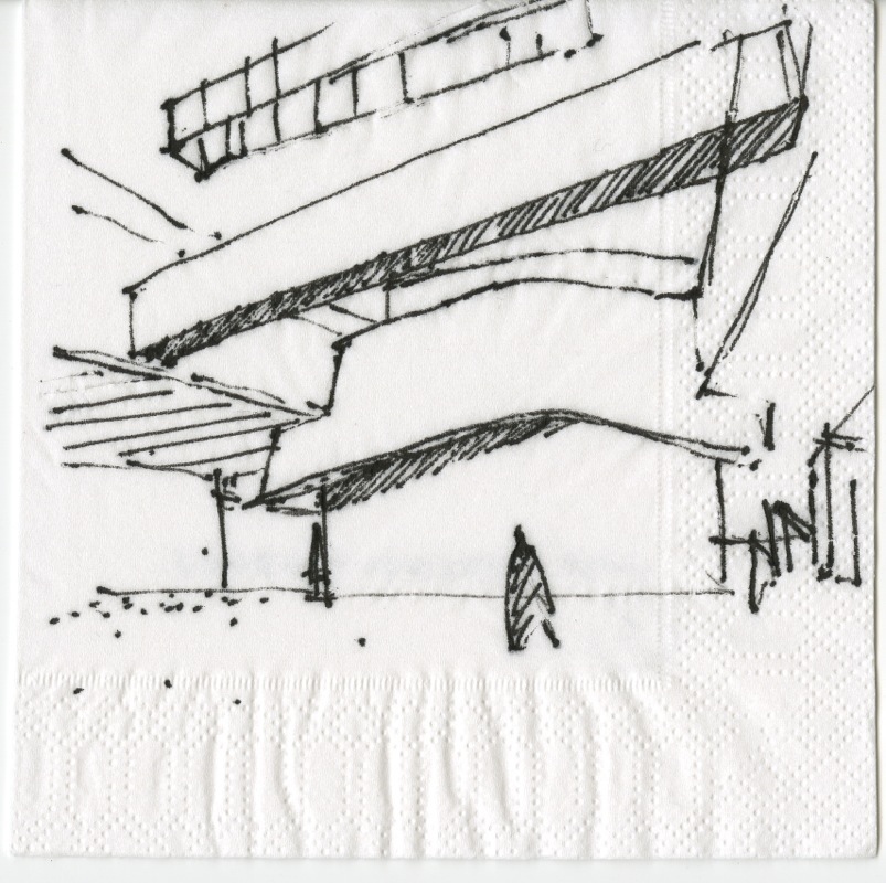
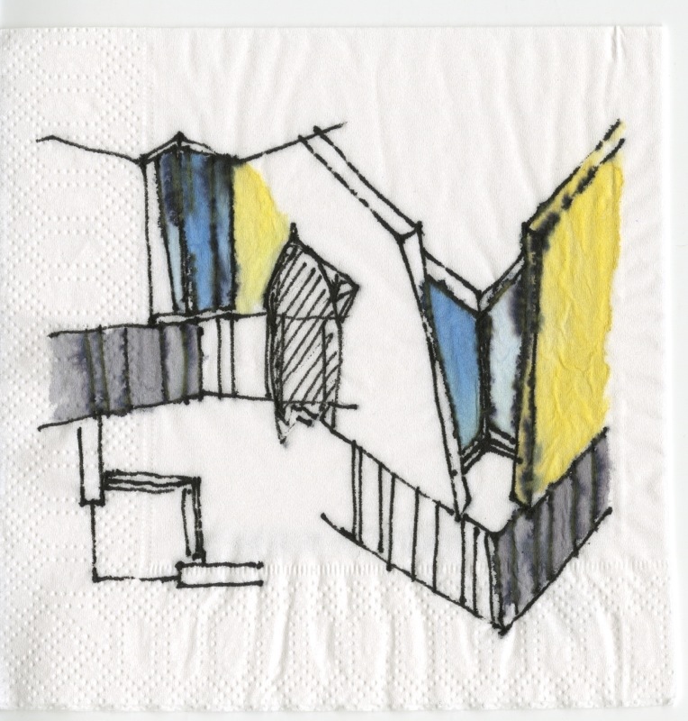
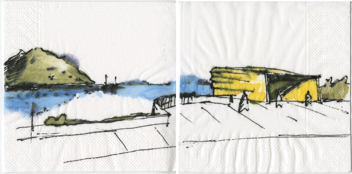
The sketches below record my first two visits to the chapel. It was raining during my first visit so I could not experience the incidence of natural light entering through the skylights. On the second visit, however, the experience was completely different. When the reflected colored natural light structs the rugged texture of the interior plaster, it creates an optical illusion. Father Gerald T. Cobb S.J. refers to the light that enters the chapel as “…light that acts like liquid, an aqueous medium spilling across interior surfaces.” In truth, it is a difficult effect to describe but the chapel interiors bathed in light give a sense as if inhabiting a watercolor.

Steven Holl’s pursuit for phenomenological occurrences is well known. In his essay A Gathering of Different Lights he mentions “… to feel these physicalities is to become a subject of the senses.” Furthermore, he adds that… “an awareness of one’s unique existence in space is essential in developing a consciousness of perception.”

Entrance & Procession; view from the Narthex towards the Baptistry.

Baptistry. Inscribed at the edge of the baptismal font: “No barrier can divide where life unites: one faith, one fount, one spirt, makes one people.”

Main Sanctuary (view from baptistry)

Main Sanctuary (towards the altar)

Main Sanctuary (view from the altar)

Holl assures us that “architecture holds the power to inspire and transform our day-to-day existence.” And while I do not claim that my sketches illustrate the phenomenon I experienced, they certainly give a sense of the spatial quality of the chapel. In fact, in my opinion, having examined Holl’s own watercolors for Saint Ignatius, they also fall short at representing the effect. However, whether intentional or not, the experience is there. Well done Holl.

Choir (looking towards the Main Sanctuary)

san francisco art institute

The campus of the San Francisco Art Institute in Russian Hill was designed in the 1920s by Bakewell and Brown, architects of the nearby City Hall and Coit Tower. Later in 1969, Paffard Keatinge-Clay, who had worked in Le Corbusier’s atelier in 1948, designed its addition. He’s also known to have worked in Mies van der Rohe’s office and apprenticed years earlier with Frank Lloyd Wright.

The new building’s program consisted of additional art studios, classrooms, faculty and administrative offices, an auditorium, gallery spaces, a cafeteria, and outdoor spaces, among others. Due to an abrupt change in topography, the addition sits below the existing complex’s main level except for its roof terrace, where the auditorium, cafe, and gallery spaces are located.

The structure resembles Le Corbusier’s Carpenter Center at Harvard, with its béton brut surfaces, ample ramps, light canons, and brise soleils being integral elements of the composition.

However, in contrast to its East Coast precedent, one could argue that at Keatinge-Clay’s building, there are far fewer poetic licenses employed. For example, at the Carpenter, a pedestrian ramp that cuts through the building allows for a way to traverse the structure, producing what Le Corbusier called an architectural promenade. The ramp as part of the spatial sequence is, in fact, one of the highlights of the Carpenter, offering — in some instances — unobstructed views of the interior spaces, art galleries, and studios.

However, once one carefully studies it, the through-block connection seems — in my opinion — a bit gratuitous since there is not much happening on the other side of the block, and you are just feet away from the corner. The main landing only allows access to a secondary entrance and ancillary programs. Also, the secondary nature of the entrance, which most of the time remained closed to the public, stresses its excessiveness.

In contrast, the ramp at the Art Institute, albeit not as sculptural as the Carpenter’s, yet indispensable, not only stitches the interior spaces of the addition with the existing main building but also serves as a connection that allows views into the interior spaces and bridges the abrupt change in topography.

The buildings’ treatment of the roof terraces contrasts significantly as well. At the Carpenter, the roof terrace or fifth façade is enjoyed solely by a private apartment for visiting faculty/artists. In Keatinge-Clay’s addition, the toit-jardín is –in contrast — the project’s hierarchical space. In true emulation of Le Corbusier’s ideas, the roof terrace at the Art Institute becomes a public square, a gathering space where multiple activities occur simultaneously.

The main space of the terrace (represented on the last sketch and axonometric above) is enclosed on three sides by the auditorium, an indoor and outdoor gallery space, and the cafeteria. The terrace openness contrasts with the enclosed nature of the main courtyard at the 1920s building next door. Keatinge-Clay’s roof terrace frame panoramic views of the city’s waterfront below

Also, the roofs over the external gallery, cafe, and auditorium become accessible terraces and not only provide additional vantage points of the city but also allow for a diverse array of activities to occur simultaneously.

poetry foundation

These sketches were done a year after I first visited this place in 2015. (Please refer to a previous post below for that first visit.) https://anonymousarchitecture.wordpress.com/2015/06/14/the-poetry-foundation-by-john-ronan-architects/

It’s been almost four years since that first visit and three since I made these interior sketches. In retrospect, I still think this is one of the most beautiful buildings I have encountered in recent years.

Plaza de Armas, Viejo San Juan


Transformed several times throughout the years Plaza de Armas today is arguably one of the best public squares in Old San Juan, Puerto Rico. The current design -depicted above- is from the 1980’s and belongs to architect, Alberto del Toro (assisted by the dissolved firm Arce y Rigau).

The space was last rehabilitated almost two decades ago. The works dealt with minor repairs to the pavements and sitting areas, but additional trees were added. Fortunately, the new planting followed the existing structure and a second line of trees — of the same species — was paired with the existing. For that reason, the original spatial organization devised by the designers remained unchanged. Some could argue that it was reinforced with the addition.

Plaza de Armas is rectangular in shape, conformed by contiguous buildings along its four sides where two civic structures stand out, the Departamento de Estado o Real Intendencia to the West (right in the top sketch) and the Ayuntamiento or Alcaldía de San Juan to the North (center down in the sketch, also at the perspective below). It is worth noting that the space does not align with any of the afore-mentioned buildings. However, the skillful designer(s) organized the urban elements at their disposition to compensate for the ‘misalignment’.

Therefore, as illustrated, a telephone cabin, a fountain and a “glorieta”, along with the mass of trees — all composed to acknowledge and reinforce — the City Hall’s main axis, perpendicular to the plaza. The mass of trees further recognize the building’s protruding arcades and the towers that flank them. (See sketch below, illustrating this space back in 2002).

The space conformed by the surrounding buildings is rectangular. However, the space’s proportion is less important than the composition of the urban elements inside the paved area of the square. The arrangement is what really organizes the space. The paved area has a proportion of 1:3.5; one square wide by three and a half squares long. The alignment with the Ayuntamiento (as illustrated) is far more hierarchical than the alignment with the Real Intendencia. Nevertheless, two monumental light posts – no others alike are to be found in the square – recognize the Real Intendencia’s longitudinal axis. Thus, proving that neither the longitudinal or transversal axis of the rectangular geometry of the space (without relating to any structure) is as relevant as the axis created by the arrangement of elements drawn by the skillful hand of the designers.

Casa Vives, Ponce, Puerto Rico

A few years ago my wife Claudia Rosa-López and I led a group of students from Polytechnic University in documenting this house. With their set of drawings they earned a Third Place award at Peterson Prize, sponsored by the Historic American Building Survey of National Park Service. Today, the students’ drawings can be accessed at the Library of Congress site through this link: https://www.loc.gov/item/pr1528/

Built about 1860 and designed by French immigrant architect Juan Bertoli Calderoni, Casa Vives in Ponce, Puerto Rico is an outstanding example of a 19th-century Puerto Rican urban residence with commercial spaces on the ground floor and residential spaces above.

officer’s club

Obra del arquitecto Jesús Eduardo Amaral el club de oficiales es uno de nuestros mejores ejemplos de arquitectura moderna en Puerto Rico. Base Ramey, Aguadilla.

20111026-092916.jpg

20111027-122202.jpg
James L Blilie Photos from 1955-58, Stationed at Eglin AFB, Florida
posted from: http://www.berettaconsulting.com

napkin sketches

A few drawings I submitted last year for an AIA/Architectural Record napkin sketches contest.

20111025-073703.jpg
view of the double volume atrium for polytechnic university’s school of architecture; under construction.

20111025-083845.jpg

20111025-083852.jpg
north façade and corner detail of spivak-velilla residence; built.

20111025-083901.jpg
simón bolivar’s monument in la esperanza, vieques; unbuilt proposal.

sketching por la isla, 2do recorrido / UPR río piedras

Estos son algunos bocetos que realizamos el pasado sábado en la UPR de río piedras.

20111011-181818.jpg
plano parcial del campus y una vista de las escaleras principales de la biblioteca lázaro

20111011-181809.jpg
varios intentos solapados para representar el atrio a doble altura del área de lectura en la lázaro. arquitecto, henry klumb

20111011-181756.jpg
sección representativa de uno de los volúmenes de salones de clase de los edificios de sociales. arquitecto, henry klumb

20111011-181744.jpg
varios bocetos de las relaciones espaciales en el nivel terrero del edificio de estudios generales. arquitectos, toro+ferrer

20111011-181733.jpg
edificio de estudios generales. arquitectos, toro+ferrer