Villa Savoye (1928-1931) Le Corbusier et Pierre Jeanneret

IMG_1759.JPG
The Villa Savoye in Poissy (outside of Paris) was designed by Le Corbusier and his cousin Pierre Jeanneret. Built in reinforced concrete the house best exemplifies Le Corbusier’s five points of modern architecture. These were:

1. pilotis – a grid of reinforced concrete columns that served as main structural support, elevating the house from the ground to allow for the continuity of the landscape underneath.

2. plan libre – given the pilotis there was no need for load-bearing walls to support the structure allowing interior walls to be placed freely and only where the program required them.

3. toit jardin or roof garden – an open-air terrace that reclaimed the landscape displaced by the occupation of the building.

4. fenêtre en longueur – horizontal windows that provided rooms with an equal distribution of natural light and ventilation.

5. façade libre – unconstrained by load-bearing considerations building skins could be arranged freely to serve the requirements of the interior spaces.

IMG_1758.JPG

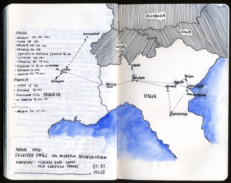
Study Abroad in Northern Italy and France

IMG_1743.JPG

Inspired by the Grand Tour tradition, made throughout history by many renowned architects, my wife Claudia and I embarked last summer on an architectural journey along with 22 students.

We sketched intensely in order to absorb as many of the myriad examples we encountered along our trip.

Having been engaged with different freehand drawing media in endorsement of figurative and abstract representation, I have focused on analytical, conceptual drawings as a means to best explain the spatial essence of architecture.

We shared with our students that our trip acknowledged the long-standing tradition of architects that throughout the centuries have transcended the power of literal representation and the nostalgic allure of freehand drawing, to engage instead in the analytical promise inherent to architectural space.

my take on illustrating Bruno Zevi’s 4th dimension in space

IMG_1744-1.JPG
While visiting Italy and France with a group of students I made this sketch — shortly after finishing our visit — to illustrate the spatial experience of Carlo Scarpa’s Castelvecchio Museum in Verona.

These are the kinds of drawings that I enjoy the most, the ones that captures a building’s essence (space and its sequence). I understand they might be hard to comprehend by the untrained eye — in comparison with a traditional two-point perspective — but their purpose is not to portray a picture but to serve as a learning tool.

Caja de Granada

20140305-231721.jpg

Designed by Alberto Campo Baeza, El Centro Cultural Caja de Granada, also known as El Museo de la Memoria Andaluza is one of the best examples of contemporary architecture in Spain.

The reinforced concrete building (exposed concrete on the outside and white plastered interiors) is comprised of a horizontal base (114 meters long x 54 wide) and an eight stories height tower. The lower volume houses the main exhibition spaces and an auditorium, among other ancillary programs. While the tower (same width as the base but 42 meters height) contains the administrative offices, cafeteria, a public library, reading and meeting rooms and a restaurant at the top that allows panoramic views of La Alhambra, the city of Granada and the nearby landscapes of Sierra Nevada and Sierra Elvira.

20140306-003222.jpg

The main façade of the building is monumental, formed by the tower — wider than it is high — rises to the west and is only pierced by the main entrance and the horizontal windows of the restaurant. The rest of the façade stands as a solid mass, as a monumental architectural screen that highlights its prescience within the surrounding context.

20140306-003442.jpg

The main entrance displays a stainless steel sliding door (mechanically operated) that serves both as banner and harbinger of the monumental scale of the museum’s interior. Once past the main entrance the sequence proceeds by descending an entire floor to a rectangular courtyard that serves as lobby to the tower as well as the main gallery spaces. The patio doubles as additional exhibition area for temporary installations.

Once inside, the sequence of exhibition spaces is organized around an elliptical courtyard, undoubtedly the most important space in the museum. The courtyard emulates in scale, spatial organization and hierarchy the circular courtyard of El Palacio de Carlos V, not far in the Alhambra, and to which Campo Baeza pays homage with the building. The main feature of this open space — in addition to its elegant proportions and monumental scale — is a pair of helicoidal ramps that apart from defying gravity (and many requirements of the ADA law) connect the exhibition spaces, allowing for a dynamic and diverse spatial sequence. Recognized by Campo Baeza himself, the ramps emulate — somewhat literally — Berthold Lubetkin’s penguin pool (1934) at the London Zoo.

20140306-003552.jpg

Le Corbusier’s Le Poeme de l’Angle Droit

This sketch is based on the mural of Le Corbusier’s Swiss Pavilion at the Paris University Campus that I visited for the first time this past summer.

C.5. The image of a woman’s body with a unicorn’s head.

The vessel drifts on
with voices singing on board
as all becomes strange
and is transposed
carried up
and is reflected on
the level of elation

20140212-005727.jpg

places I’ve drawn, but have not yet visited series: Le Corbusier’s (& José Oubrerie) L’eglise Saint-Pierre de Firminy

Designed in the mid-1960’s, this church by Le Corbusier was completed by José Oubrerie in 2006 who was a member of the original design staff. Construction started in 1973 but was halted in 1978 due to political conflicts. These drawings were made while looking at slides that my wife took when she visited it.

20130211-003142.jpg

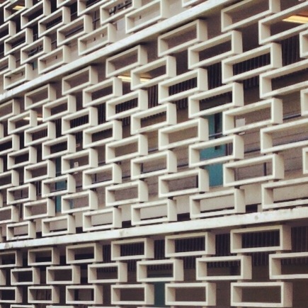
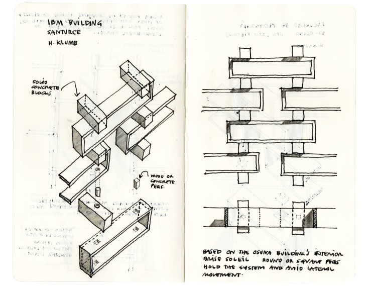
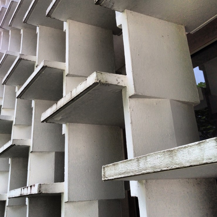
concrete forms: brise soleils of Henry Klumb

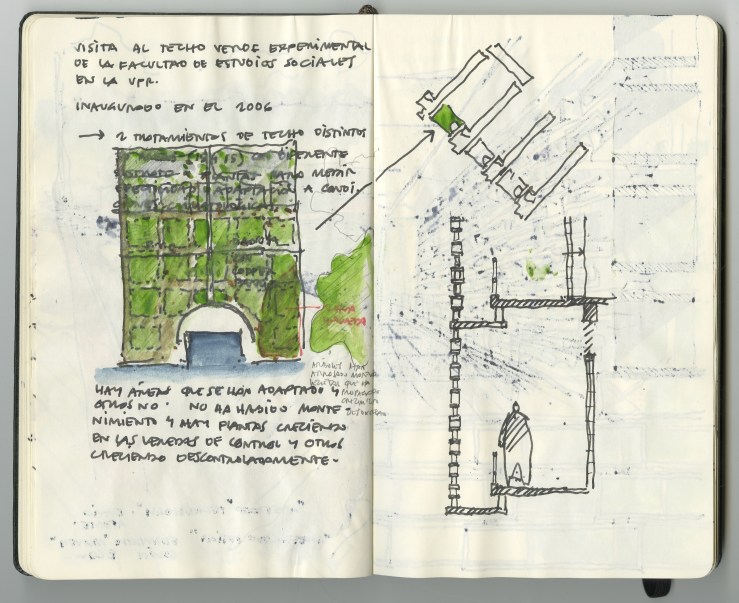
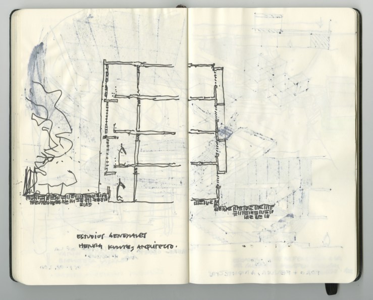
After years of photographing, sketching and even having listened to unsatisfactory explanations, it wasn’t until recently – while visiting the Río Piedras Campus to see the remains of an experimental green roof – that I gained consciousness of the constructive, or rather assembly logic of Henry Klumb’s brise soleil system at the Osuna Building. The following sketches and photos aim to illustrate my understanding of these and other quiebrasoles found at several of the German master’s buildings.

20130128-072237.jpg

20130101-042423 p.m..jpg Based on the concrete brise soleil system at the Juan José Osuna Building, Pedagogy Faculty at the University of Puerto Rico in Río Piedras.

20130128-072519.jpg

20130101-044853 p.m..jpg Based on the concrete façade system at the former IBM building in Santurce, Puerto Rico. The same system was used at the Student Center at the Mayagüez Campus of the University of Puerto Rico.

20130128-072838.jpg

20130101-050351 p.m..jpg Sketch is based on the reinforced concrete brise soleil system at the Law School building at the University of Puerto Rico, Río Piedras Campus. The same system was used at the main library at the Mayagüez Campus.

These are the sketches I made on the visit to the green roof.

20130203-125138 a.m..jpg
Plan of the green roof at the Faculty of Social Studies and a small site plan indicating its location within the building. The section of the main hallways that lead to the classrooms shows the spatial relationship of the quiebrasoles; the drop and gap between screen and hallway accentuate the separation of the façade freeing it from the main structure. This sketch fails to illustrate the fact that at every level the brise soleil displaces outward at least 6 inches from its vertical axis; a subtle change only visible to those who pay attention. (I wasn’t on that day since I was amazed of my recent discovery).

20130203-125159 a.m..jpg
This pages (a rather awkward composite of sketches) illustrate several aspects of the system; the one point perspective tries to emulate the spatial feeling of the hallways; while at the margins a section and elevations of the screen give way to the ‘blow up’ details of the concrete spacers.

20130203-044016 p.m..jpg
Here’s a section of the classrooms that i made on a separate visit. It not only illustrates the screen’s displacement as you climb floors, but also shows the stepping of the courtyards as one progress from one to the next.

Sert House in Cambridge, Massachusetts

Sert House in Cambridge, Massachusetts (1957-1958) is considered a paradigm of the courtyard-house-type. Designed by the Catalan master Josep Lluís Sert as his private home while he was dean at the GSD the house was conceived as a prototype to be paired with its mirror, “…as part of a future group in a row.”

The house sits on a 900m2 trapezoidal plot of land previously owned by Harvard, at Irving Street, northeast of campus near the Divinity School. Although Sert thought the structure to fit on a 500m2 plot since its basic rectangular form is only 40 x 100 feet – excluding the two protruding volumes of the garage and guest room which expands it to 60 feet wide.

Le Corbusier’s Modulor dimensions and proportioning system were applied throughout the house. Thus, the floor plan proportions derive from the central courtyard, a 7.32m x 7.32m (twice 3.66m), from which the living and dining areas, and the bedrooms volume, as well as the two enclosed courtyards at the north and south are set.

20120812-083650 p.m..jpg

The sketch above is based on one made by Sert himself where he budgeted the house cost and laid out the basic spaces.

20120812-103949 p.m..jpg

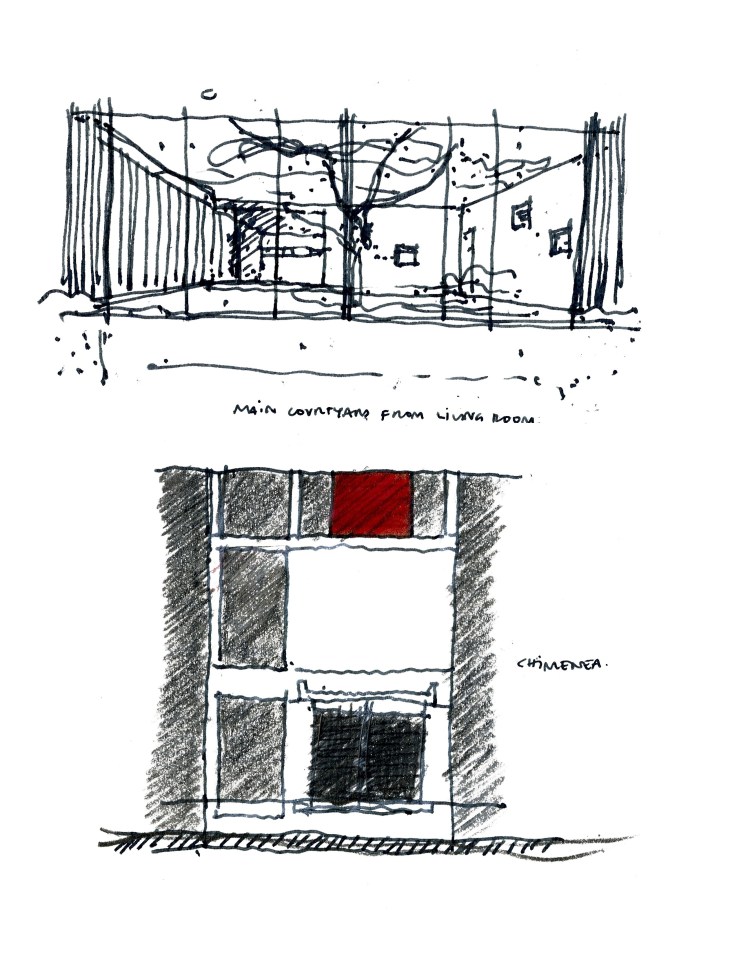
Above is a spatial axonometric of the house and transversal section of living and dining room.

More important for me in this page is the small floor plan sketch illustrate a row of trees that were planted by Sert inside his property limits but outside the bedrooms courtyard wood fence, an idea that provided an extended sence of the southern boundaries, years later became a property limit issue with the neighbors.

20120812-104018 p.m..jpg

Below, on top of the perspective view of the main courtyard there’s a partial interior elevation sketch of Sert’s wife dressing room. Here the longitudinal mirror is capped by a pair of square windows in order to cast an equal amount of natural light to the person in front of it. Below the mirror is a cantilevered drawer chest, all of which as been set (mirror and drawers) at seating height.
20120812-104440 p.m..jpg

20120812-104149 p.m..jpg